
The aim was to create a mural that celebrated local heritage, involved the local community, secured local ownership and promoted civic pride.
Funding was secured from LCC’s Cultural Fund and NHLF, along with Historic England, Fylde BC and Kirkham Town Council.
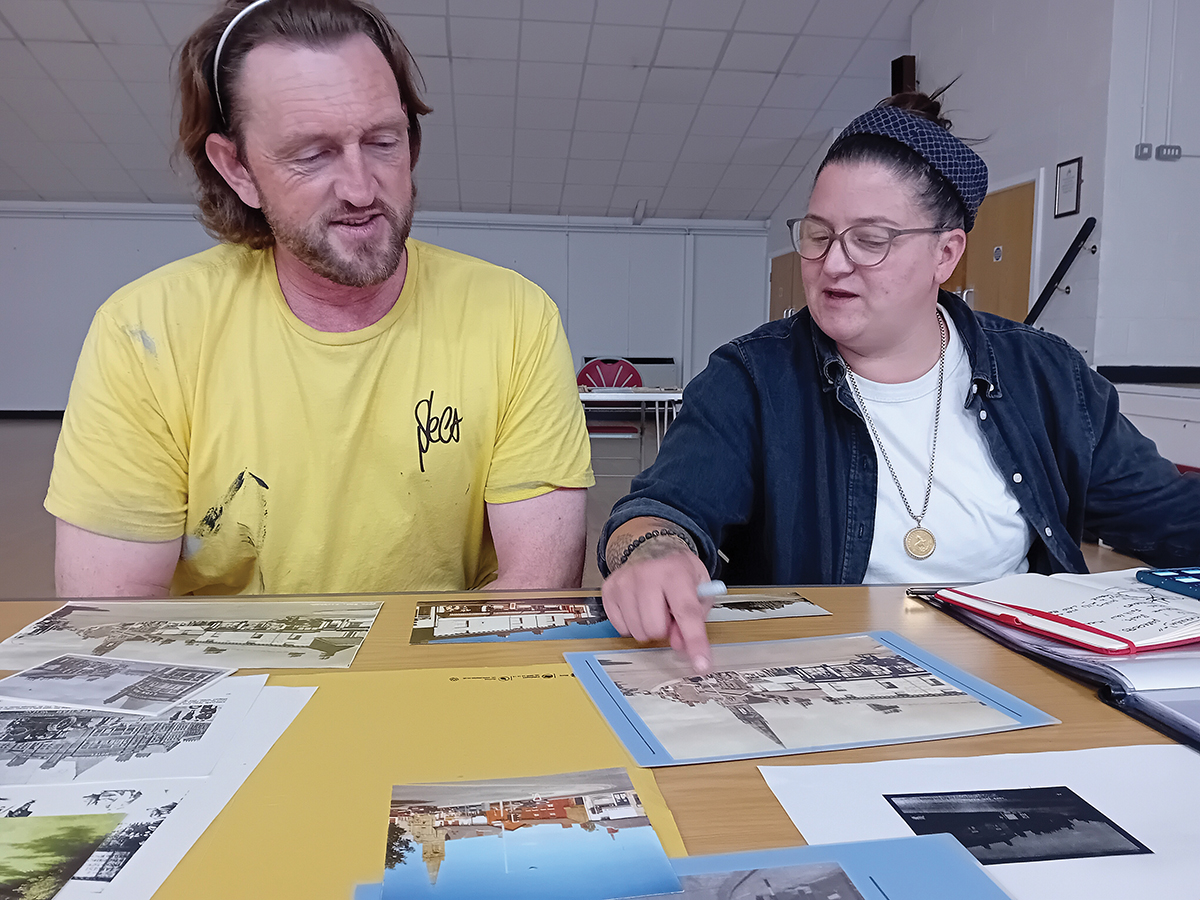
The mural was co-designed through a high-quality community engagement programme, that resulted in a creative brief. The procurement process included representation from local businesses, the community and key partners to secure creative professionals who would deliver a high-quality contemporary artwork that would animate the high street.
Artists Hayley Garney and Christian Fenn were commissioned to create the mural.
This project formed part of Kirkham’s Historic England HAZ Cultural Programme and The Romans are Back in Kirkham NHLF programme.
Superb! Environment is so important to people. This is amazing! I hope everyone appreciates the physical and psychological value of this incredible work of art!
For more information on this project and related projects you can view the brochure created to celebrate all of the fantastic work undertaken over three years in Kirkham at the link below:
Co-design and co-create approach
Animate the high street
Raise awareness of the town’s rich heritage
Promote civic pride
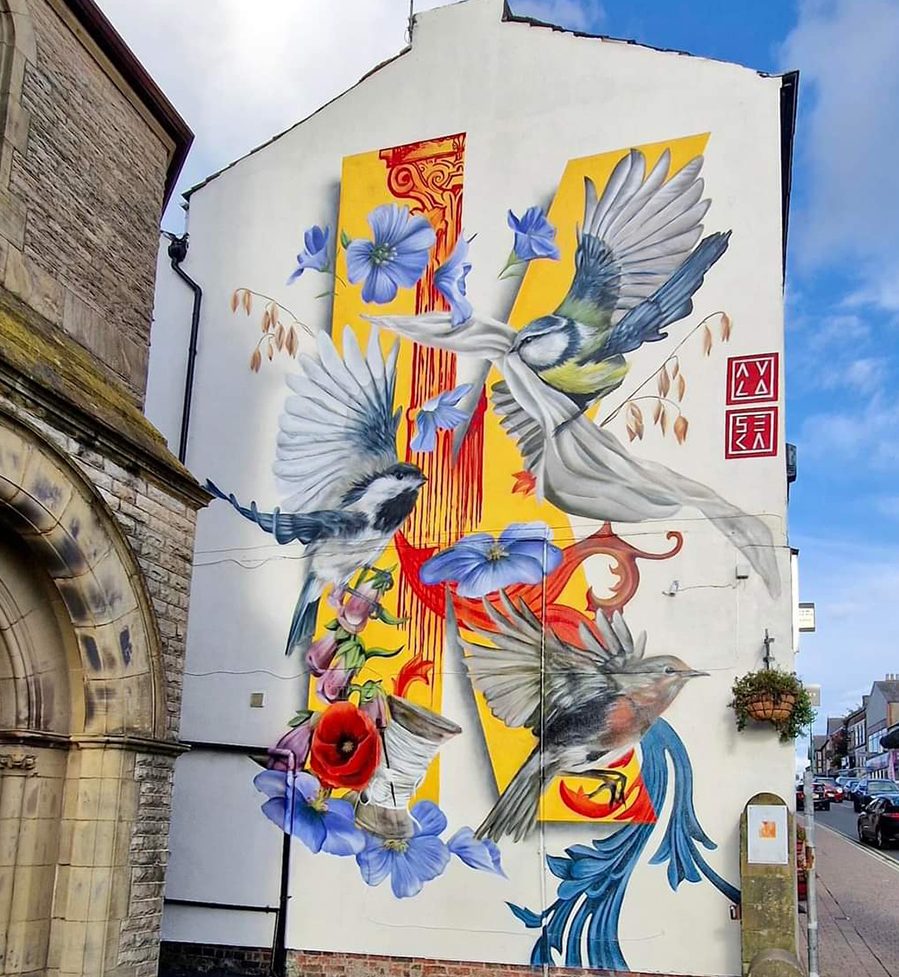
Interpretion of the Mural
Inspired by Medieval illuminated letters, the design centres around the letter K. The vibrant colours beckon viewers in from afar, inviting them to delve deeper into the layers of history and nature.
The work is full of symbolism, referencing the town’s industrial past and the Roman fort that once existed. Magpies and a robin signify both joy and renewal. The wild poppy is a heartfelt homage to the people from Kirkham who fought, who sacrificed and who are forever etched in the town’s history. Flax flowers, the spool of cotton and the sail cloth pay tribute to the textile industry. The foxglove, commonly found in the area, symbolises strength and resilience, whilst the oats pay homage to Kirkham’s rich agricultural legacy. The red Roman pillar stands tall acting as the backbone of the mural, a reminder of the ancient civilisations that once trod this land. Its inclusion serves as a bridge between the past and the present.
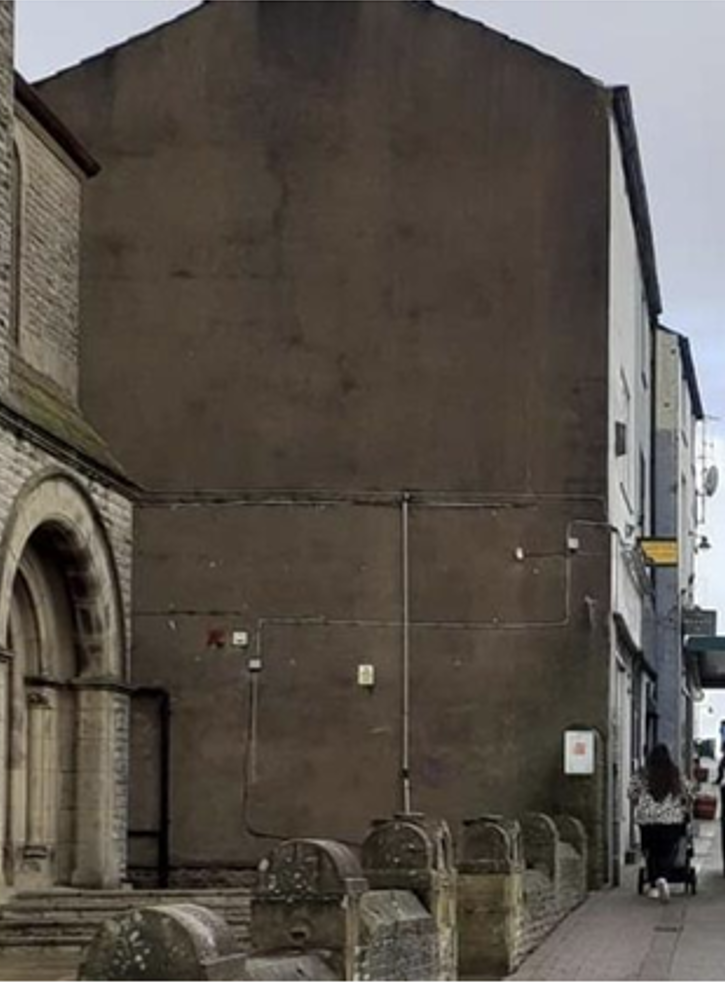
BEFORE
Inspired by Medieval illuminated letters, the design centres around the letter K. The vibrant colours beckon viewers in from afar, inviting them to delve deeper into the layers of history and nature.
This couldn’t be more relevant and inclusive. Beautifully done too!
The work is full of symbolism, referencing the town’s industrial past and the Roman fort that once existed. Magpies and a robin signify both joy and renewal. The wild poppy is a heartfelt homage to the people from Kirkham who fought, who sacrificed and who are forever etched in the town’s history. Flax flowers, the spool of cotton and the sail cloth pay tribute to the textile industry. The foxglove, commonly found in the area, symbolises strength and resilience, whilst the oats pay homage to Kirkham’s rich agricultural legacy. The red Roman pillar stands tall acting as the backbone of the mural, a reminder of the ancient civilisations that once trod this land. Its inclusion serves as a bridge between the past and the present.
After
